
Case Study
Optimizing Jobinar:
From Costly Platform to Scalable Solution
A UX audit that turned into something much bigger: figuring out they were on the wrong platform entirely, making the case to switch to Wistia, and saving €15,000 a year in the process.
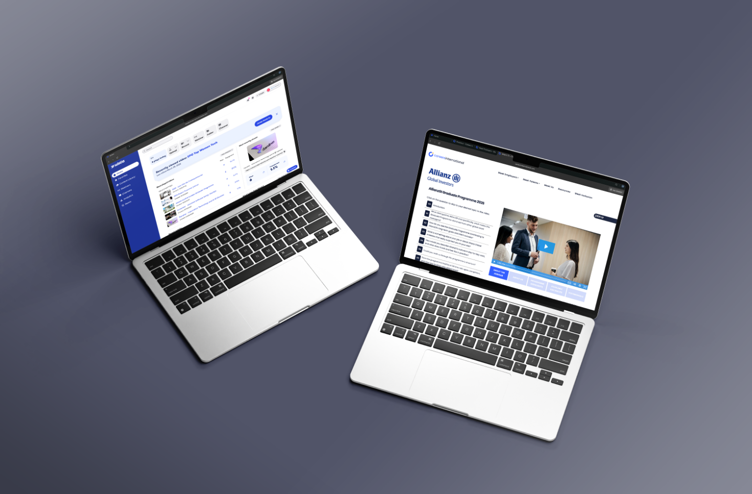 Wistia Platform & Jobinar final UI on device
01. Project Overview
A platform working against the business
Jobinar is an online training and webinar platform for HR and recruitment professionals. When they came to me, they were spending a fortune on a rigid, over-engineered platform that was both expensive to run and frustrating to use.
What started as a UX audit quickly uncovered something much bigger: the wrong platform entirely. Through structured research, competitive analysis, and technical evaluation, I identified Wistia as the right replacement: a move that saves Jobinar €15,000 every single year while dramatically improving the experience for every user on the platform.
This project is proof that UX work isn't just about screens. Sometimes the most impactful design decision is a strategic one.
02. The Challenge
The problems were structural, not cosmetic
The audit found problems at every level: costs, the technology, and the actual experience. None of it could be patched with a visual refresh. The existing infrastructure had grown into a liability: expensive, rigid, and actively making the experience worse for both the team and their users.
Massively Over-Priced Platform
The platform costs were completely out of proportion to what it actually delivered. Jobinar was paying premium rates for features they didn't need or use.
Poor Video Streaming Quality
Buffering and low-quality playback caused significant user drop-off during paid webinars, directly damaging the product's core value proposition.
Confusing UX & Navigation
Participants couldn't easily find, access, or replay sessions. The information architecture had no clear hierarchy, and users needed multiple wrong turns to reach content.
Zero Analytics or Engagement Data
The old platform had no useful analytics. No watch-time, no engagement signals, no drop-off tracking. Decisions were being made with no data at all.
Broken Mobile Experience
Over 40% of users accessed the platform on mobile. The existing system had no responsive behaviour on any key page or video player.
High Maintenance Overhead
Every content update needed a developer, which took up time that should have gone into content and growth.
The insight that changed everything: During the audit, the numbers showed the platform was costing Jobinar over €15,000 a year more than it needed to, for a service that was actively making the experience worse. The opportunity wasn't just UX improvement. It was a €15K annual saving hiding in plain sight.
03. UX Research & Insights
Research that changed the strategy
This wasn't standard UX research. Alongside user journey mapping and experience analysis, I conducted a full technical and commercial evaluation of the platform landscape, looking for not just a better experience, but a better business decision.
UX Heuristic Audit
A full audit of the existing platform against Nielsen's 10 heuristics, identifying every point where the experience broke down and why users were abandoning sessions.
Cost-Benefit Analysis
A detailed breakdown of platform costs vs what they actually got, with savings projected across the alternatives.
Platform Comparison Matrix
Six video platforms evaluated across cost, streaming quality, analytics capabilities, UX flexibility, and WordPress integration. Wistia scored highest on every dimension.
User Journey Mapping
End-to-end mapping of the attendee journey from sign-up to replay access, tracking every friction point and drop-off along the way.
Mobile Experience Audit
A dedicated look at the mobile experience across key pages and the video player, documenting every broken responsive behaviour.
Analytics Review
Review of available session data to quantify drop-off rates, identify high-exit pages, and validate qualitative findings with behavioural evidence.
Key Insights
What the research revealed
Six findings came out of the research. The strategic recommendation and every design decision after that came back to one of them.
- The platform cost was massively disproportionate: €15K in annual overspend identified and quantified
- The platform was completely unreliable - you never knew if it was actually going to work
- The platform did not allow us to update and improve UI of the jobinars
- Wistia outperformed all alternatives across every evaluation criterion: cost, quality, analytics, flexibility
- 40%+ of users were on mobile with a completely broken experience across all key pages
- Switching to wistia helped reducing reliance on developers and speeding up updates
04. UX Strategy
A plan built on evidence
The strategy had two parts: a case for switching platforms (backed by the numbers), and a UX redesign to fix the core experience issues no matter which platform they ended up on.
Present the Business Case First
Before any wireframes, I put together a recommendation for the team: cost analysis, platform comparison, projected savings. We needed to agree on the direction before designing anything.
Rebuild the Information Architecture
Completely restructured the platform's content hierarchy, separating live webinars, replays, and resources into clear, navigable categories with consistent labelling and intuitive access paths.
Redesign Around the Video Experience
With Wistia as the foundation, every UI decision was built around the video: clean layouts, smart replay logic and a library that makes it easy to go back to past sessions.
Mobile-First from Scratch
Rebuilt every key page and the video player for mobile first, then scaled up to desktop. The opposite of how it had been done before.
Before & After — Platform Comparison
What changed
⚠ Before — Old Platform
Massively over-priced
Costs completely out of proportion to value delivered
Poor video streaming quality
Buffering and drop-off during paid webinars
Confusing navigation
Users needed 3+ wrong turns to find content
Zero analytics
No watch-time, engagement, or drop-off data
Broken on mobile
No responsive behaviour across any key page
✦ After — Wistia-Based Solution
€15,000 saved every year
Platform cost slashed immediately and recurring annually
Best-in-class video quality
Wistia's player eliminates buffering and drop-off
Content found in one click
Rebuilt IA with clear webinar library and categories
Rich analytics dashboard
Watch time, engagement heatmaps, and drop-off data
Fully responsive
Mobile-first rebuild across all pages and the video player
Design Process
How strategy became execution
UX Audit
Heuristic review, analytics, user journeys
Cost Analysis
Platform comparison, savings projection
Strategy
Business case, migration recommendation
Wireframes
IA rebuild, wireframes, user testing
Build & Launch
WordPress, Wistia, responsive QA
05. Wireframes
Sketching the new experience
With the platform confirmed, the wireframes focused entirely on fixing what the research had found: confusing navigation, no mobile experience, and a video page that got in the way of the content.
The homepage was rebuilt around a single question: "What is Jobinar, and how do I access my content?" That question is answered immediately on landing. Clear CTAs for live sessions, replays, and new registrations separated at the top level.
The biggest UX failure was users not being able to find past sessions. The library was rebuilt with category filtering, a consistent card layout and a search that finds content in seconds.
The video player page took five rounds to get right. The final version puts the video first, with speaker info, resources and related sessions below rather than crowding the player.
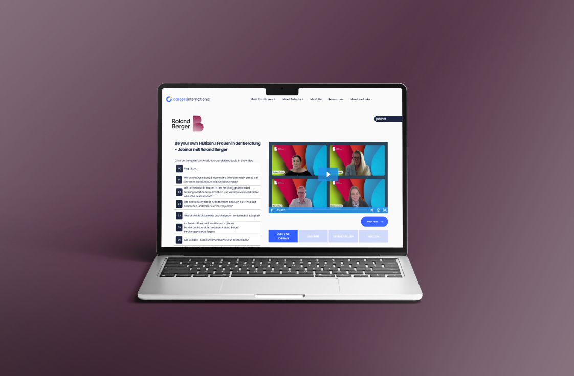 Video player page — Wistia embed, content hierarchy
Over 40% of users were on mobile, so I designed mobile-first. Everything started at 375px, with extra care on the video player touch experience and how the library cards looked on small screens.
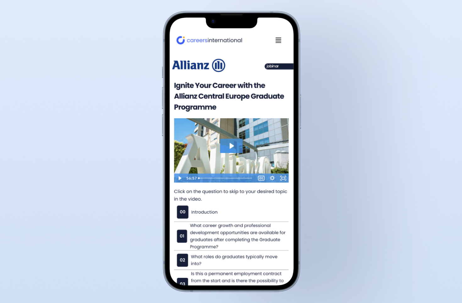 Mobile — Video Player
On the platform decision: The migration recommendation was presented before a single wireframe was drawn. Stakeholders were nervous at first - platform switches feel risky. But the cost analysis was hard to argue with: €15,000 a year in savings, and every other metric pointing the same way. The data made the decision pretty straightforward.
06. UI Design
A platform that feels as good as it works
The redesign stripped back everything that wasn't serving the user. Video first, navigation clear, content one click away. The visual style is clean and calm because the platform's job is to stay out of the way of the content.
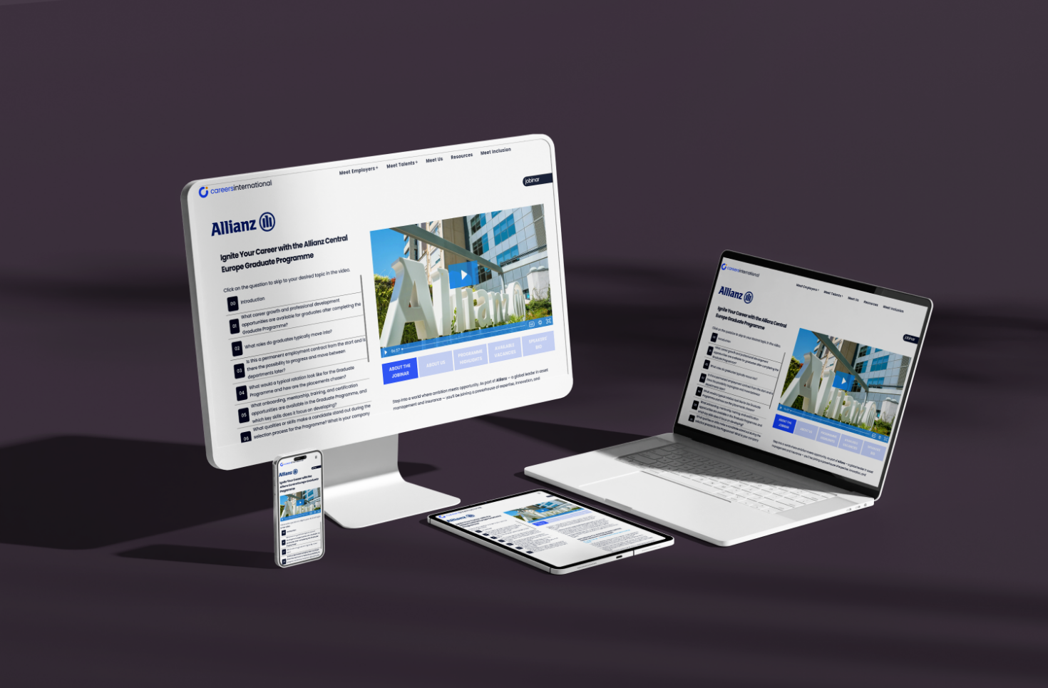 Final UI — Platform homepage (Desktop, Laptop, Tablet, Phone)
07. Results
Strategy that moved the numbers
This one's a good example of how UX work can go beyond screens. The €15K saving is real, it repeats every year, and it came directly from the research. On top of that, the experience for users is genuinely better.
€15K
Saved every year
since the platform migration
↑↑
Customer experience
enormously improved
100%
Every decision
traced back to data