Case Study
Anita Diamonds:
Designing for Luxury, Trust and Precision
A high-end UI/UX project for a diamond company in Antwerp: deep product research, competitive benchmarking, and a custom diamond repertory feature built to help customers find the right stone.
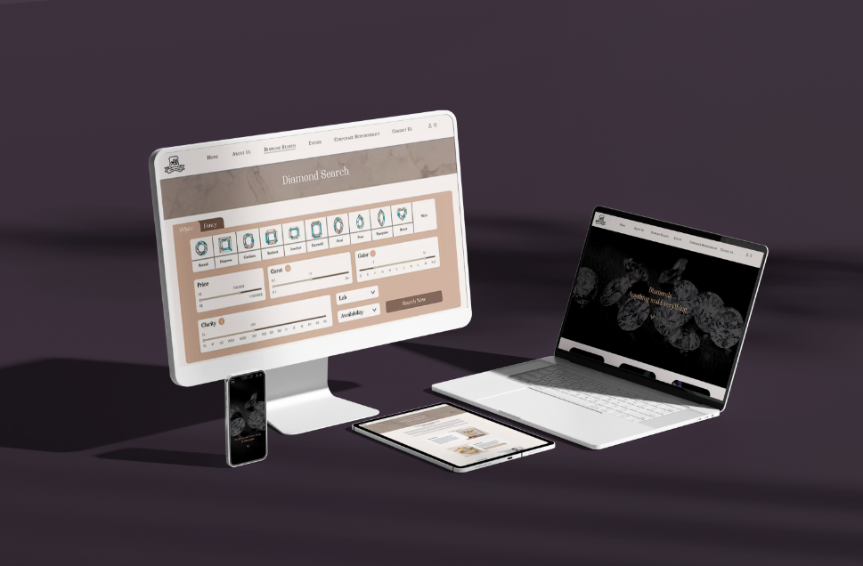 Final UI across desktop, tablet and mobile
01. Project Overview
A diamond brand that needed a website to match its product
Anita Diamonds is a diamond company based in Antwerp, one of the world's leading diamond trading cities. They came to me wanting a website that felt as considered and high-end as the stones they sell: nothing generic, nothing off-the-shelf.
The project pushed me to go well beyond just designing screens. I spent serious time learning about diamonds: cuts, grades, certifications, how buyers actually shop. That research fed directly into the design, especially the diamond repertory feature that sits at the heart of the site.
The design is complete and currently in development.
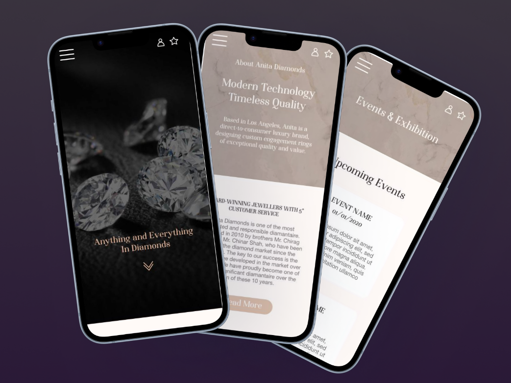 Mobile screens overview
02. The Challenge
Luxury is hard to fake, and easy to get wrong
Diamonds are a high-trust, high-consideration purchase. Buyers spend weeks researching before they commit. The website needed to earn that trust immediately, while also making a complex product — with its own technical language — actually accessible to real people.
Establishing Trust at First Glance
Diamond buyers are cautious by nature. The design needed to communicate credibility and craftsmanship within the first few seconds on the page.
Making Diamonds Accessible
Cut, clarity, carat, certification: the vocabulary of diamonds is technical. The UI needed to make it approachable without dumbing it down for buyers who know what they're looking for.
A Unique Diamond Search
No off-the-shelf search tool fit the brief. The diamond repertory needed to be designed from scratch around how buyers actually think and filter when choosing a stone.
Standing Out in a Crowded Market
The luxury jewellery space is full of websites that look similar. Anita Diamonds needed a visual identity and UX that felt distinctive, not just polished.
03. UX Research & Insights
You can't design for diamonds without understanding them
Before touching Figma, I spent real time learning the product. That meant reading about the 4Cs, understanding certification systems, and studying how diamond buyers actually search and compare stones. Alongside that, I ran a full competitive benchmarking exercise to understand what the best luxury jewellery websites do well — and where they fall short.
Diamond Product Research
Deep research into how diamonds are graded, certified and sold. Understanding the 4Cs (cut, colour, clarity, carat) and what buyers look for when comparing stones.
Competitive Benchmarking
Intensive benchmarking of leading luxury jewellery brands: what visual codes they use, how they handle product pages, where they build trust, and where they frustrate users.
Buyer Journey Mapping
Mapping how a real buyer moves from first discovery to serious consideration: what questions they have, what reassures them, and what makes them leave.
Key Insights
What the research revealed
Five things shaped every design decision that followed.
- Luxury websites win trust through restraint: less clutter, more white space, precise typography
- Buyers want to filter diamonds by the criteria they actually care about, not just price
- Corporate responsibility and ethics matter to modern diamond buyers, especially around sourcing
- Mobile experience is often neglected in the luxury space, despite significant mobile traffic
- Photography and visual quality are the primary trust signal before any written content
04. UX Strategy
Four principles that drove every decision
With the research done, I defined four things the design had to get right. Everything else came second.
Trust Before Conversion
Every page earns trust first. That meant leading with quality photography, clear certifications, ethical sourcing commitments, and a brand tone that felt knowledgeable without being intimidating.
A Diamond Repertory Built for Real Buyers
The search feature was designed around how buyers actually think, not how databases are structured. Filters for cut, clarity, carat and shape — with simple visual labels rather than technical codes.
Restrained Visual Language
Luxury communicates through what you leave out. A tight colour palette, generous spacing, and high-quality imagery kept the design feeling premium without being cold.
Mobile as a First-Class Experience
Many luxury sites treat mobile as an afterthought. Anita Diamonds was designed mobile-first throughout, with particular care given to the diamond search on small screens.
Design Process
How strategy became execution
Research
Product research, benchmarking, buyer journeys
IA & Flows
Sitemap, page hierarchy, user flows
Wireframes
Lo-fi to mid-fi, structure validation
UI Design
Visual identity, high-fidelity screens
Prototype
Interactive prototype, handoff for dev
05. Wireframes
Structure before style
Four key pages wireframed: the homepage, the about us page, the corporate responsibility page, and the events and exhibitions page. The wireframes focused on hierarchy and flow before any visual decisions were made.
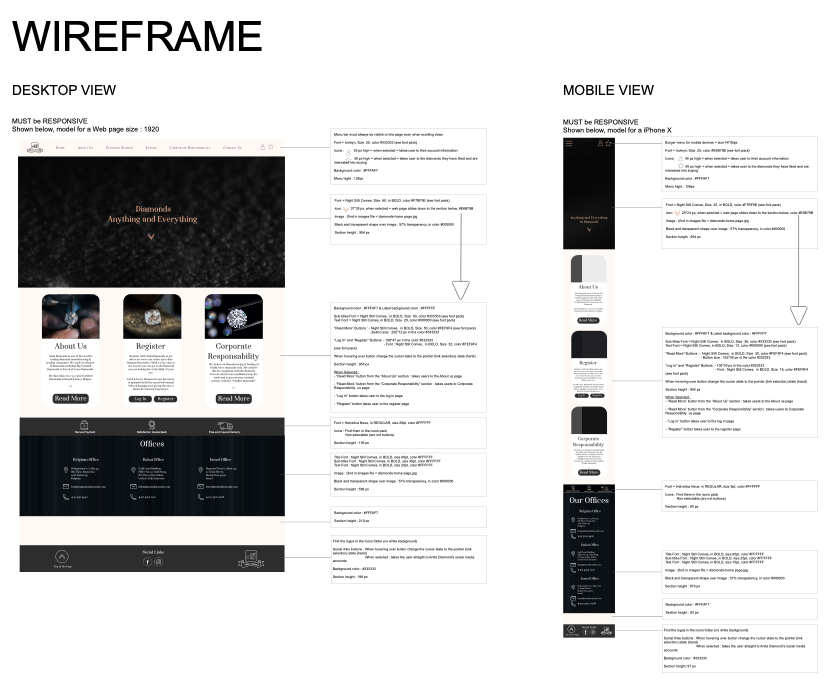
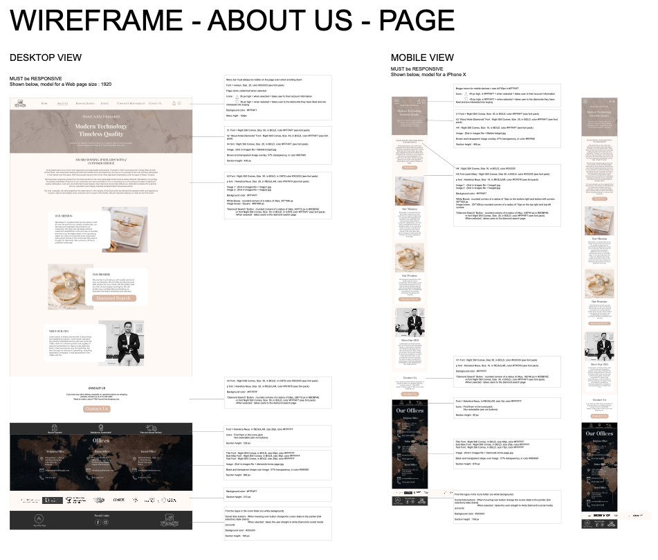
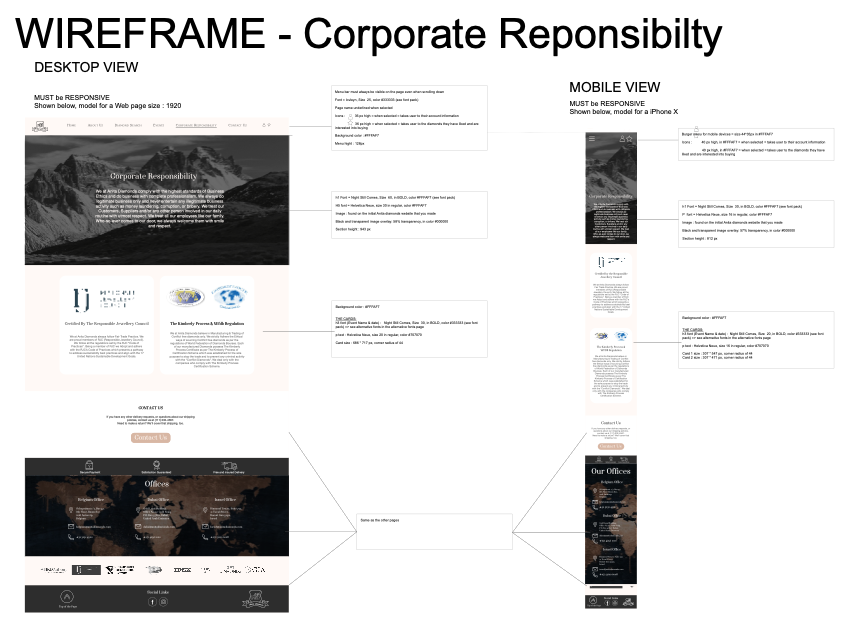
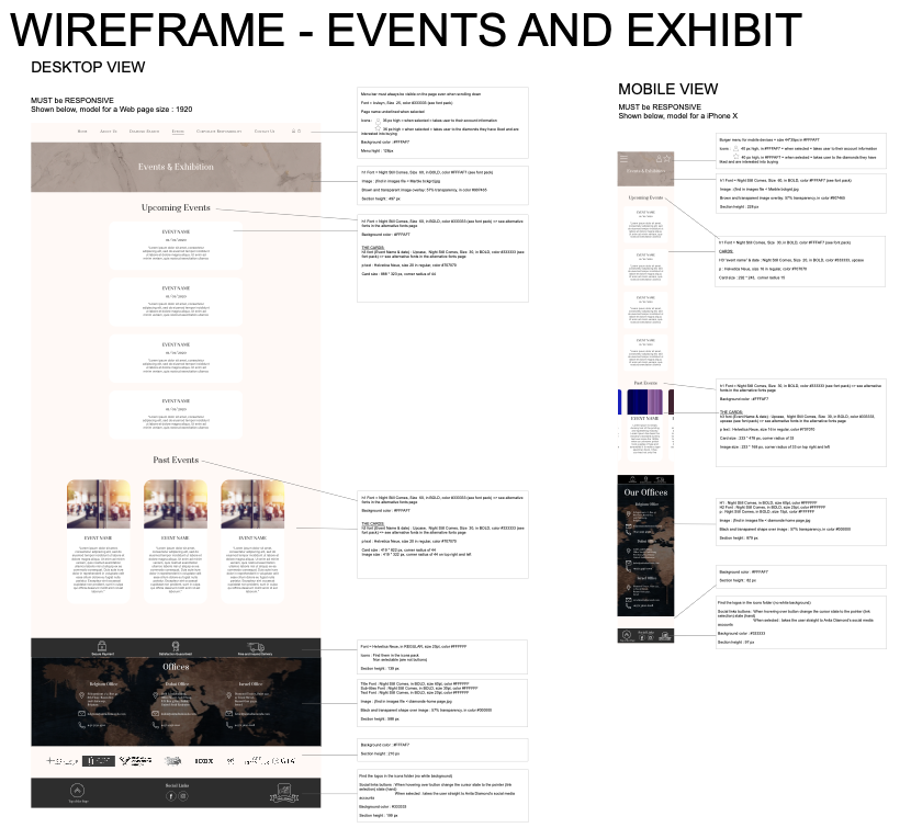
On the wireframe process: I went through two rounds before moving to high fidelity. The biggest change between rounds was the homepage hierarchy: the first version buried the diamond search too far down. The final wireframe brings it into the first scroll so users can get into the product right away.
06. UI Design
Luxury that works on every screen
The final UI uses a restrained palette, editorial typography and high-quality stone photography. The diamond repertory is the centrepiece: a clean, filterable catalogue where every entry shows the key specs a buyer needs to make a decision.
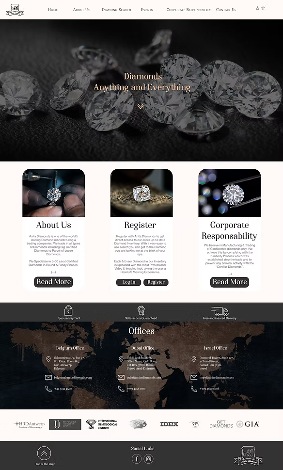 Homepage — final desktop UI
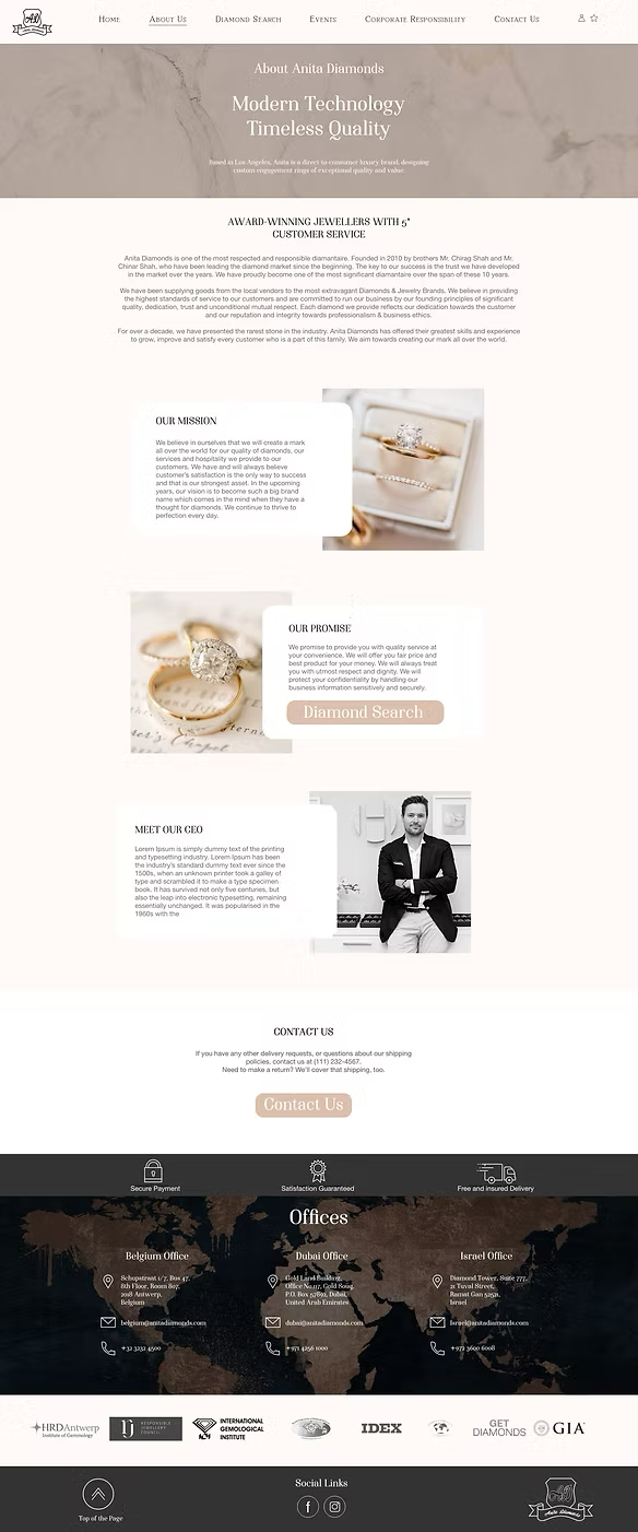 About Us — final desktop UI
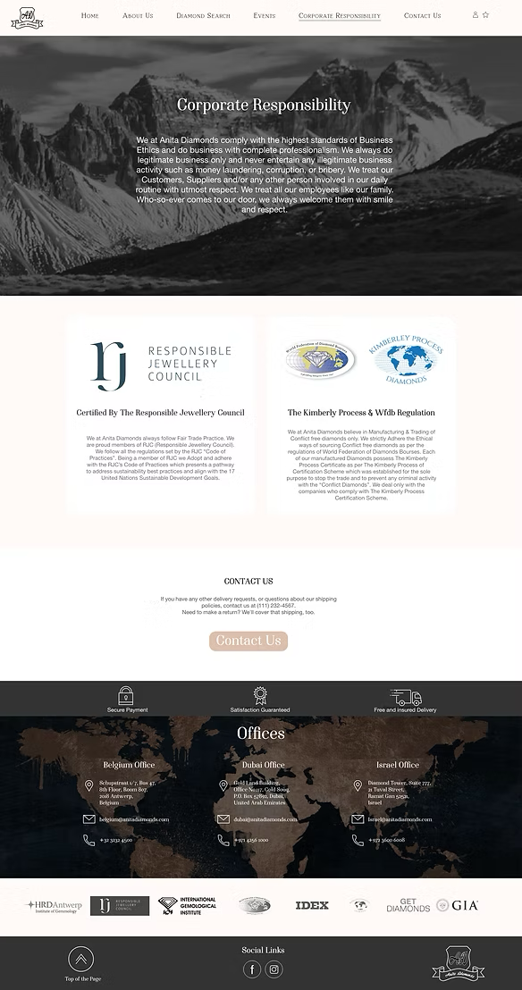 Corporate Responsibility — final desktop UI
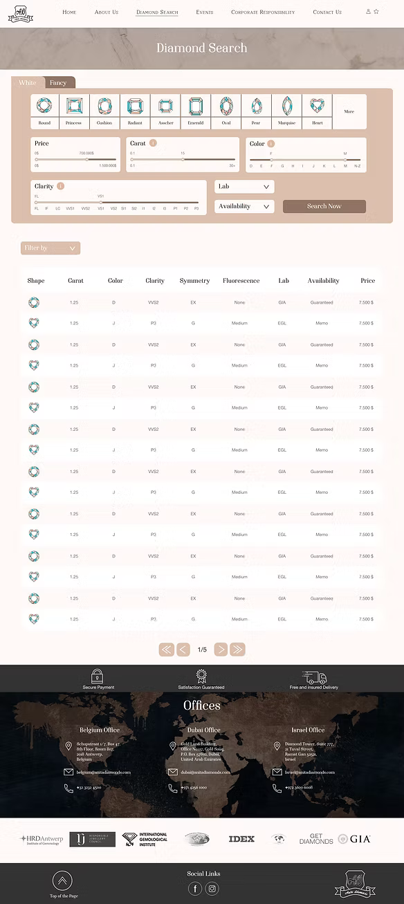 Diamond Repertory — custom search feature
Mobile
Mobile first, every time
Each page was designed for mobile before scaling up to desktop. The diamond search was a particular focus: making it easy to filter and browse stones on a small screen without losing any of the detail buyers need.
Mobile screens overview
 Homepage — mobile
 About Us — mobile
 About Us (scrolled) — mobile
 Corporate Responsibility — mobile
 Events & Exhibitions — mobile
07. Results
Design ready, development underway
The full design is complete and has been handed off for development. The client has a high-fidelity prototype covering all key pages and user flows, ready to build from.
5
Pages fully designed
and prototyped
100%
Mobile-first design
across all screens
Custom
Diamond repertory
built from scratch