Case Study
Reimagining Careers International:
From Brand to Digital Experience
I rebuilt Careers International from the ground up: new brand, new UX, and a custom WordPress build. The result is a site that looks professional and actually converts.
01. Project Overview
A platform built to connect people with purpose
Careers International is a global recruitment and career advisory firm helping individuals and companies navigate hiring, transitions, and workforce development. Despite strong expertise, their digital presence failed to communicate their value — it felt outdated, was difficult to navigate, and didn't convert visitors into enquiries.
The brief was ambitious: rebuild the brand from the ground up and deliver a website that felt as polished and trustworthy as the service itself. That meant building a proper visual identity, designing around real users, and delivering a WordPress site the team could manage themselves.
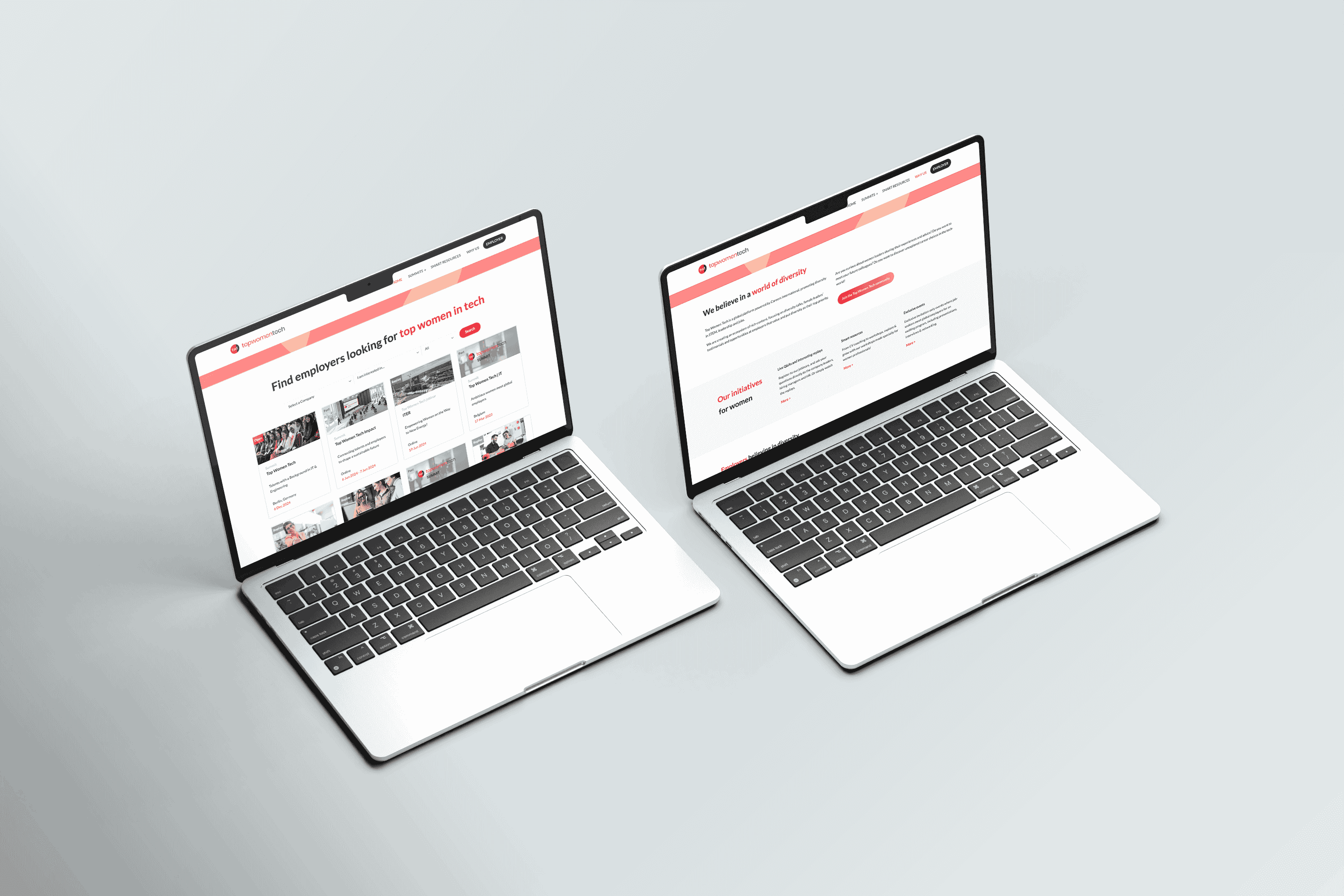 Previous Website Design
02. The Challenge
Turning complexity into clarity
The existing platform had grown organically without a coherent strategy, leaving a fragmented experience for both candidates and employers. We needed to untangle years of accumulated decisions and start fresh, without losing the trust the brand had already built.
Outdated Visual Identity
The brand lacked a consistent visual language. Colours, typography, and iconography were mismatched across every touchpoint.
Poor Information Architecture
Candidates and employers were lumped into the same navigation, creating confusion and high drop-off rates on key pages.
Low Conversion Rate
Despite meaningful traffic, the site generated very few qualified enquiries. CTAs were buried and value propositions were unclear.
Unmaintainable Codebase
The previous site required developer intervention for every content update, slowing down the team and increasing costs.
03. UX Research & Insights
Listening before designing
Before putting a single pixel on screen, I spent time understanding who was actually using the platform, what they needed, and where the experience was breaking down. I used three research methods to make sure the findings were solid and pointed in the same direction.
Stakeholder Interviews
5 in-depth interviews with the Careers International leadership team to map business goals, brand aspirations, and key success metrics.
Qualitative Research
3 user interviews and intensive competitor benchmarking to uncover real pain points and unmet needs.
Analytics Audit
Deep dive into Google Analytics to identify drop-off patterns, high-exit pages and where traffic was coming from.
Key Insights
What the research revealed
Six things kept coming up in the research. Every design decision after that traced back to at least one of them.
- Users couldn't tell within seconds whether the site was for candidates or employers
- Trust signals (testimonials, case data) were absent or buried deep in the site
- Mobile experience was broken; most form interactions failed on iOS
- The website did not clearly convey Careers International’s services or value proposition
- The brand identity and UI felt outdated, with a generic and uninspiring website personality
- Job listings lacked adequate filtering, forcing users to scroll through irrelevant content
04. UX Strategy
A clear path from insight to experience
Once I had a clear picture from the research, I defined four things the design needed to fix, each tied directly to a problem we'd found.
Audience Clarity First
Redesign the information architecture so that candidates and employers are separated at the homepage level, with distinct journeys, language, and CTAs tailored to each audience.
Trust at Every Touchpoint
Put social proof (case studies, stats, testimonials) throughout the journey rather than hiding it on a page no one visits.
Conversion-Led Structure
Replace generic CTAs with context-specific calls-to-action at decision points. Map each page to a conversion goal and remove all friction from the path to enquiry.
Content-Team Empowerment
A modular WordPress system with Elementor enables so the team can update content without needing a developer every time.
Design Process
How strategy became execution
Research & Synthesis
Interviews, analytics, competitive audit
IA & User Flows
Sitemap restructure, journey mapping
Wireframes
Lo-fi → hi-fi, stakeholder validation
Brand & UI Design
Identity system, design system, prototypes
Build & Launch
WordPress, animations, QA
05. Wireframes
Sketching the structure before the style
Wireframing let me test ideas quickly and get feedback before touching any visual design. I went through three rounds: rough sketches, mid-fi wireframes, then annotated hi-fi prototypes.
The homepage was redesigned around a single guiding question: "Am I in the right place, and what should I do next?" - answered within the first scroll. A split hero section immediately shows candidates and employers their own separate paths.
A major structural shift was separating "For Candidates" and "For Employers" at the navigation level, using a mega-menu structure that surfaces sub-pages and key resources without requiring deep navigation. This alone reduced the average pages-to-conversion from 6 to 3.
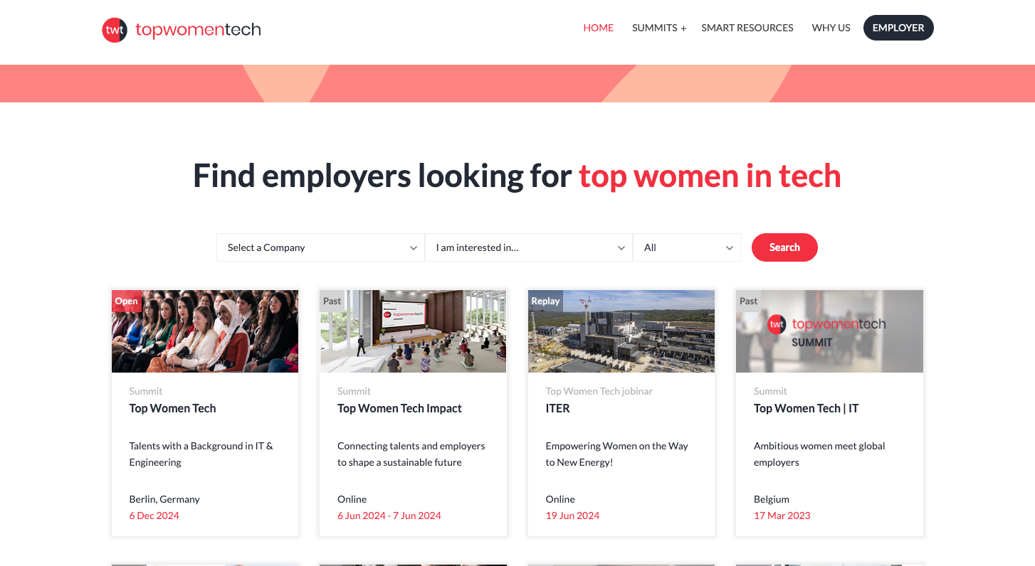 Previous navigation structure
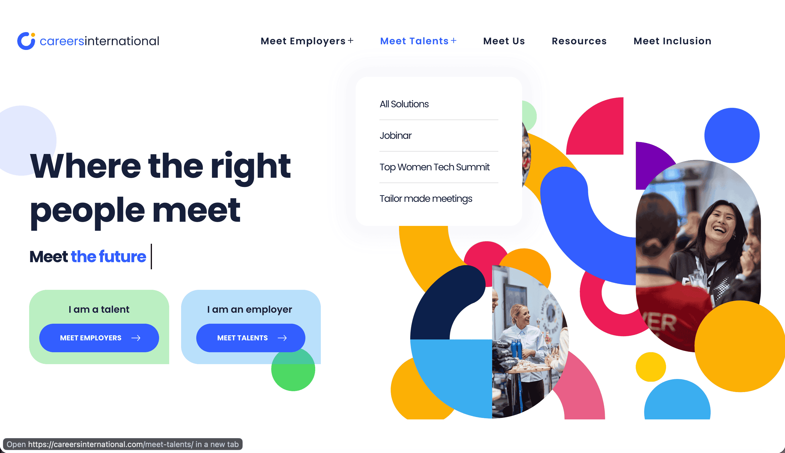 Redesigned navigation — mega-menu wireframe
Over 60% of traffic came in on mobile, so I designed mobile-first throughout. Everything started at 375px, with extra attention on forms and navigation on iOS.
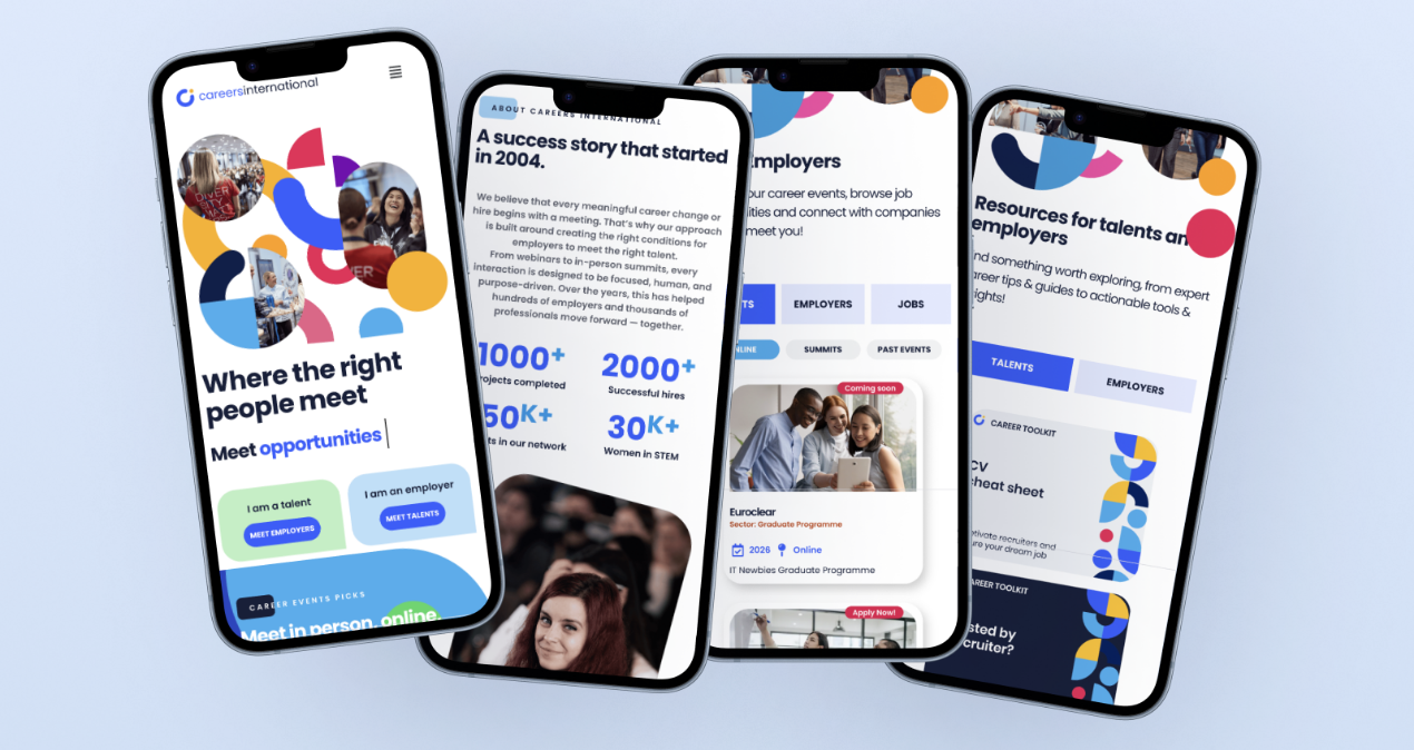
On iteration: The wireframe phase had three rounds of stakeholder review. The biggest change came after round two: stakeholders initially wanted one unified homepage, but testing showed that splitting by audience reduced bounce rates.
06. UI & Branding
A visual identity built for trust and ambition
The brand needed to feel confident but approachable. I used strong typography, a clear colour palette and photography of real people rather than generic stock photos.
Colour System
Typography System
International.
We help companies build high-performing teams and individuals navigate meaningful career transitions — with precision, discretion, and genuine expertise.
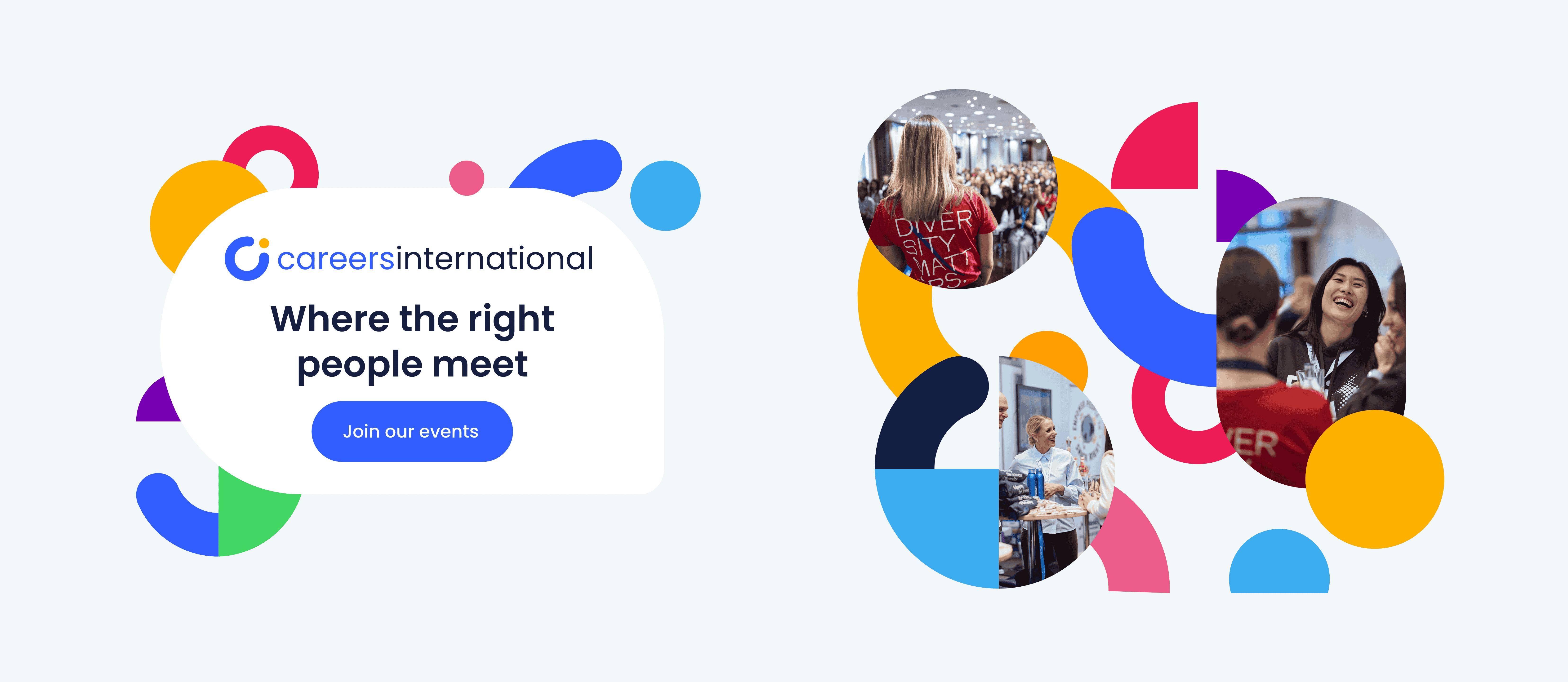 Brand Styling
07. Results
Design that moved the numbers
Within three months of launch, every key metric had improved.
Accessibility
Imporved accessibility throughout the intire website
Bounce Rate
Proven bounce rate reduction
across pages
Approx 5×
Faster content updates by
the internal team